reD Studio Connects Spaces
reD (researchIIenquiryIIDesign) is a multi-disciplinary Mumbai-based design studio headed by three architects — founding partners Ekta and Rajiv Parekh, and Maithili Raut. Established in 2004, the partners have worked on projects of all sizes across the country – from small interiors to massive campuses. Here we put the spotlight on how the design studio repurposed a dark 30,000 sqft building into a spectacular family house. By Amrita Shah

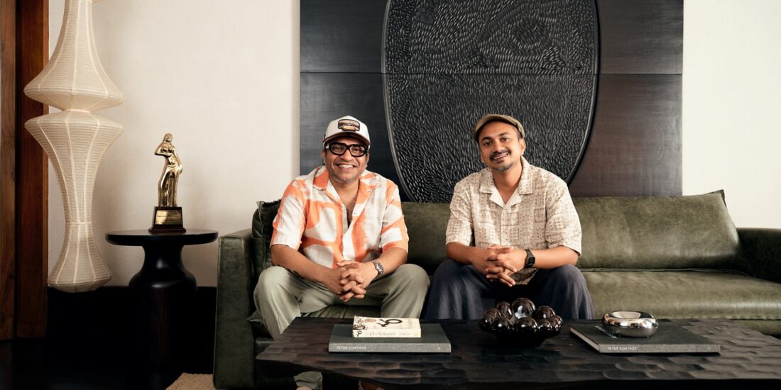
The three principal architects of reD; Maithili Raut with Ekta and Rajiv Parekh.
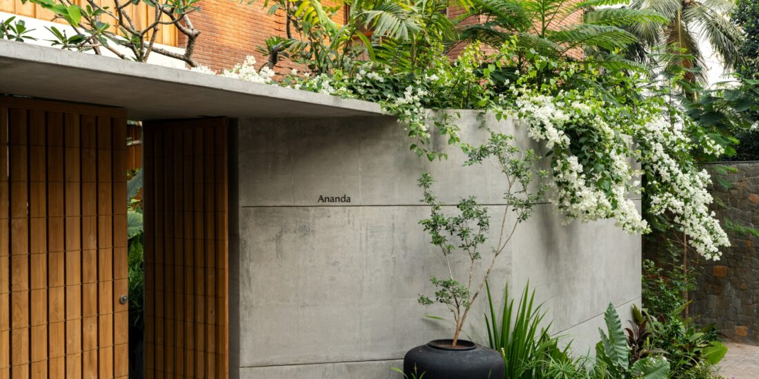
Building sites can provide all sorts of challenges. The partners at reD Architects were approached by an existing client’s relative to repurpose a 30,000 sqft building into a family home. The structure in question was a 3-storey apartment building with a basement, stilt area and a 4-bedroom flat on each of the 3 upper levels. Located in Delhi’s upmarket Vasant Vihar area, the building was built to optimise the entire plot, so the wall plates abutted the compound walls on 3 sides in a fashion that is common in the city. The structure did not work as a house – it was simply a building with 3 separate apartments. With the neighbouring houses constructed in a similar fashion, there was barely any distance between the two buildings and natural light was minimal and there were no views to be enjoyed. The only saving grace of the plot was the garden across the road from the front façade.
Ekta and Rajiv Parekh were the principal architects of this project. Their first response was to visually connect the floors and make the building seem like a cohesive bungalow as opposed to individual apartments. Floor slabs were punctured and an atrium was created in the heart of the house, culminating in a skylight at the terrace level that was conceived as a shallow water trough.

The central atrium that visually connects all the floors.
The water feature plays are integral to the design of the house: the light and shadow patterns cast by the sun moving over the water into the courtyard and the weather outside constantly change the mood of the house and it’s no surprise that the architects have dubbed the project ‘Watercourt House’. The water body also serves to help cool down the space and reduce the air conditioning load – helping the home play a pivotal role in diminishing carbon footprint. A motor-operated translucent blind shut this off during the extreme summer months and prevents the excessive evaporation of water.

The ground floor dining room pairs a wood and leather table from Rugiano with Baxter chairs. To the left of the table are pivotable panels in leather and mirror from Rugiano, which can screen off the living room beyond. At the far end are mirrored lens-panels on the exterior wall, which bring in light but prevent clear views into the home.
Since the house had to be conceived of as an inward-looking space because of the proximity to the neighbouring houses, the architects created two green walls on top of the existing compound walls that ensured filtered light permeated into spaces and there was a visual connect with nature from all the rooms.

The green wall beyond that gives each floor a visual relief.
Planning the house was then just a response to the site and the family’s requirements. The space allocation was simple – the parents and their two sons got a floor each, while the basement would serve as the entertainment area for the family. The stilt area with its motorised boundary walls houses the parking, services and staff quarters as well as a play area for the family dogs. From the entrance walkway one gets a sense of the entire house; below one can see the basement level, and above, the sunlight streaming in through the water covering all the walls with constantly moving rippled shadows that change with the light.

Vertical grooves on the customised poker table, the ms plates of the bar, the fluted curved partition shielding the service areas and the barcode-like texture of the black stone walls create a fun play of materials and textures in the gaming area of the basement. The chairs for the poker table and the bar counter beyond are from Mascheroni.
In the basement is yet another double-height courtyard which overlooks one of the green walls and leads to a guestroom. A series of arched openings braced with mild steel plates and clad with grey limestone slabs carved with horizontal grooves line the courtyard and offer glimpses of the entire expanse of the floor and surround an industrial-looking wall sculpture by Mumbai-based artist Remen Chopra W Van Der Vaart.

The ribbed limestone arches are clad with the same grey limestone as the floor. The mild steel edge detail gives the courtyard an industrial glam look. An artwork by Remen Chopra Van Der Vaart stands in front of the vertical green landscaped wall that runs along the height of the building.
A plush home theatre, dining and lounge area lie to one side of the atrium, while the game room lies to the other. The ribbed base of the customised poker table echoes the texture of the arches, as do the mild steel fins cladding the bar. A textured wall made with vertical strips of polished black stone strips of varying depth runs along the entire length of the game room, its gold veins picking up the colour of the marble floor.

The custom made mild steel table in the basement is coupled with Tonon dining chairs and hanging lights are from Moooi. The curved, fluted, and painted wall in the background hides the pantry. The columns are clad with the same limestone as the floor.
Following the industrial glam aesthetics of the floor, the 10-seater dining table is made of oxidised mild steel with its sides cut out into arches to form multiple legs, echoing the arch element in the courtyard. A curved partition conceals a pantry, the service elevator and a spiral stair. This element continues to the top, creating a service core that runs along one side of the atrium with the curved glass partition of the kitchen comprising one wall of the central atrium.

The primary bedroom is actually 2 conjoined suites in the ground floor, each with its own bed, side tables and TV unit, walk-in wardrobe, and bathroom. Wall-like panels in a grooved and painted finish slide open into a common lounge area and combine the three spaces.
Each of the living floors has a similar plan: dining area near the kitchen, the living area toward the front of the building to make the most of the garden view, and the bedrooms located at the back. The open staircase connects all the living spaces, but large sliding walls enable the residents to seal off this area if needed. The ground floor where the parents reside is defined by the use of yet some more dynamic elements. The primary bedroom was conceptualised as two conjoined master suites. Wall-like panelled sliding partitions flanking both sides of the common lounge open up to reveal two bedrooms, each with its own bed, walk-in wardrobe and bathroom – the perfect solution to address the different body clocks of the couple. Separating the living and dining areas are centrally pivoted panels that are clad with leather on one side and mirror on the other; a flip of these panels and the aesthetics of the room changes, and the spaces are combined or made private.

The parent’s living room on the ground floor is more classic in its décor with painted and panelled walls with mouldings and a splattering of collectibles on the various side tables. A series of panels on pivots between the living and the dining areas serves to divide or combine the spaces as the need arises. Finished with a dull teal leather on one side and mirror on the other, the panels also serve to change the look of the space when pivoted.
Walls clad with moulded panels painted a soft shade of grey, subdued furnishings on classically designed pieces, a linear fireplace that wraps around a wall, delicate brass dining chairs and a sprinkling of artefacts – the room speaks of quiet elegance.

In the first floor living room an L-shaped couch from Minotti is flanked by a chair from Morosso and two chairs from Baxter, complemented with another curved couch from Minotti at the other end of the space. The wall behind the furniture arrangement has a metallic wallpaper further adorned with a paper work from Sachin George Sebastian.
In contrast, the floors appointed to the two sons are far more contemporary. A master suite at the far end and a smaller guest room that could be repurposed as a child’s room in the future, with a study alcove tucked into the connecting corridor, these two floors were designed as places for the boys and their future families to grow into.

Grey and copper tones dominate the first-floor living room. The copper wall is a composition of copper panels in different stages of oxidization and complements the warm tones of the walnut ceiling.
The similarity in these two floors ends with the floor plan. The first floor is an expression of grey and coppery tones highlighted by the verdant greenery outside. dining area features a distressed metal crockery cabinet by Henge while the feature wall in the living room is clad with copper panels in different stages of oxidation.

On the first floor, a dining table from Amura is coupled with chairs from Henge and placed next to a distressed finished metal crockery cabinet also from Henge which echoes the copper details on this level.
Grey limestone flooring and a smoked walnut-clad ceiling tie the spaces together. The walls of the corridor leading to the bedrooms are treated with concrete textured paint and embedded with copper strips that form a grid along the entire surface, concealing a powder room done up completely in copper. The corridor culminates in a study nook with a Giorgetti desk outside the master bedroom. The tones of grey and copper browns continue into the bedroom too, where grey leather combines with honey-toned wood in the furniture sourced from Rugiano.

The long corridor on the first floor has been treated with textured paint in a concrete finish, with highlight strips of copper that open up and blend in with the copper finished powder bathroom hidden behind a concealed door. In the foreground are prints of old Delhi maps.
While the first floor is in line with the canopy of trees, the second floor opens up to the expanse of the sky. The living room is bright and airy and the window wall is clad with customised textured panels made of cast coal and brass.
An L-shaped sofa from Minotti, a couch from Baxter and an assortment of small tables in different materials – wood, stone and metal give the room a relaxed vibe and make for a flexible seating experience. In the dining space, metal strips in cement finish walls provide a backdrop for the circular dining table from Minotti and beautifully crafted chairs from Henge. The architects maintained the same layout for the powder bathroom on all the floors, but changed the material palette for each one for a bit of fun. While the one on the first floor was in copper, the one on this level was finished completely in brass to echo the brass detailing used on the walls. In the master bedroom grooved wall panelling offset with backlit glass provide a backdrop for a Giorgetti bed. The smoked oak wooden floor in the bedroom leads to a large bathroom where two rows of wardrobes flank a bathtub, the vertical garden outside adding a splash of green.

The water body on top of the skylight creates an inviting landscape feature on the terrace. The row of bushes bordering the terrace seem to be part of the garden across the street.
The visual connect with nature continues to the terrace too; the green wall continues up and creates a quiet sanctuary in the massage room. The water body becomes part of the terrace landscape and offsets the grassy patch at the far end, while bushes lining the periphery of the terrace seem to be continuous with the greenery around, connecting the house to its surrounds.
All Images Courtesy reD Architects