Font Farewell: Calibri to be Replaced
After a 14-year presence on our Microsoft word processors as the default font, Calibri is finally stepping down. The decision comes after Microsoft recently announced its plans to replace the sans serif font with one of the five new fonts it released. By Amiya Hisham
Most of us who have used Microsoft Office, after performing our literary redactions, have been persuaded to hit Ctrl+A and convert the text to Times Roman, Arial or Helvetica depending on how official our purposes were. However, when on a deadline with no time for fancy formatting one could fall back on Calibri. Popularly the font is known to be a non-upsetter – it has neither terribly impressed nor offended anyone. It simply worked. Calibri was designed in 2004 by Lucas de Groot, a Dutch typeface designer and first appeared as the default font for Windows Vista in 2007. It was created as part of a collection of fonts for enhanced screen reading. Up until the 2000s computers lacked the pixel density to render all fonts with integrity. At the turn of the millennium, Microsoft’s new ClearType technology optimised the resolution on LCD screens, improving the legibility of fonts like Calibri. In its solemn tenure as the default font, Calibri first attracted serious attention when it became the subject of talk in a case tagged ‘font gate.’ A few years ago, the use of Calibri gave away falsified documents produced before the supreme court in Pakistan even as the then Prime Minister’s daughter insisted, they were dated 2006, when the font was not widely in circulation yet.
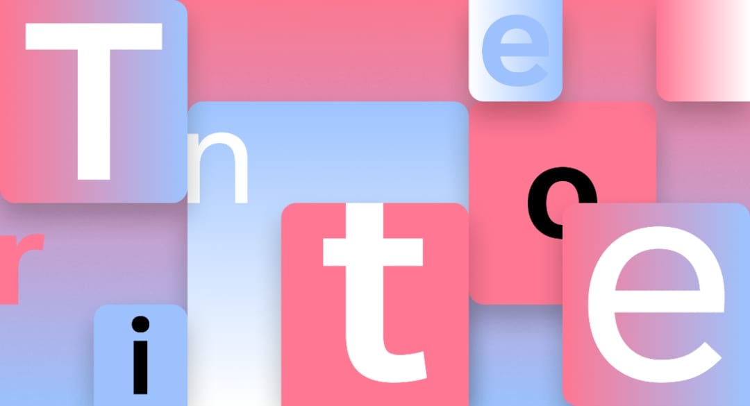
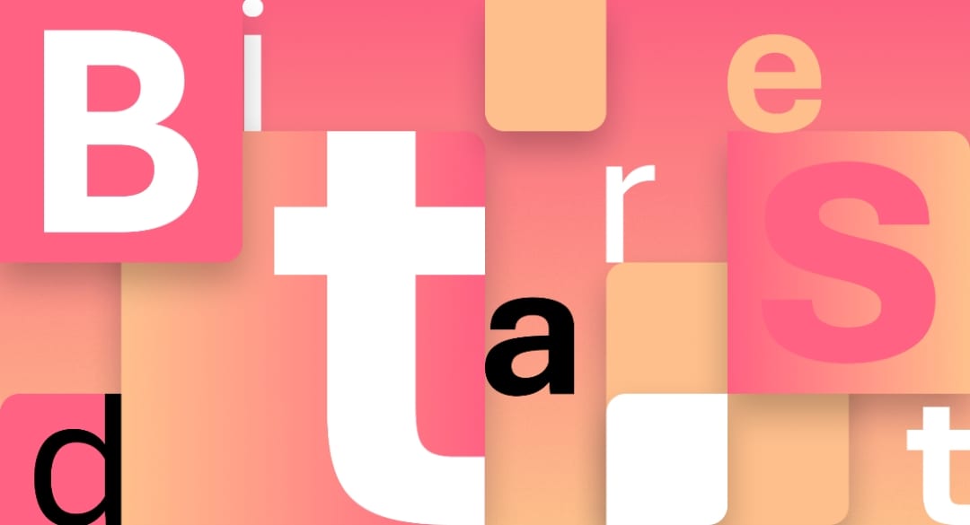
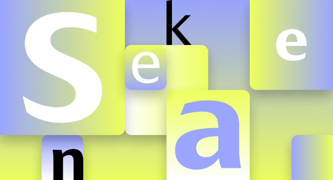
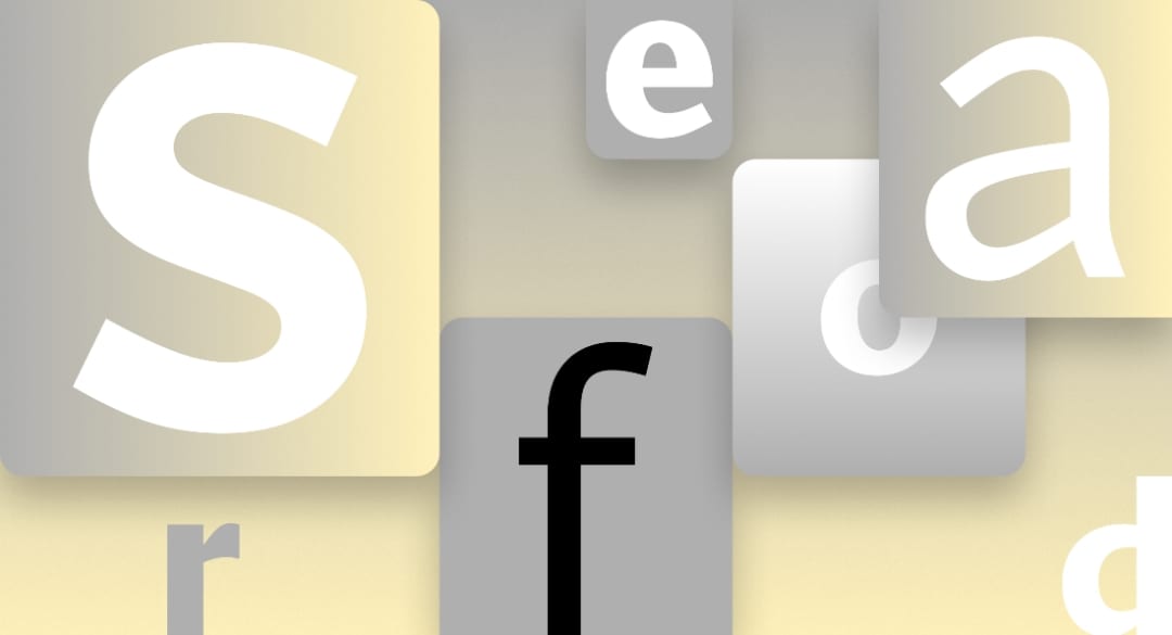
The five new fonts that will compete to replace Calibri are TENORITE, designed by Erin McLaughlin and Wei Huang, BIERSTADT by Steve Matteson, SKEENA by John Hudson and Paul Hanslow, SEAFORD by Tobias Frere-Jones, Nina Stössinger and Fred Shallcrass, and GRANDVIEW by Aaron Bell. For those keen on the kerning and matters of such typographic importance, here is the overview:
Tenorite is designed in contrast to Calibri’s narrow proportions, wide and circular, taking inspiration from Avenir but with a tighter fit so as to accommodate more words in a single line.
Bierstadt belongs to the grotesque sans serif genre which are block-style letters without calligraphic flourishes. The most famous of these is Helvetica by Switzerland’s Haas Type Foundry. Bierstadt’s designer Matteson pays homage to the venerated font and the Swiss International style, by making a reference to the Alps, which for him is iconic of Switzerland. Bierstadt is named after one of the Colorado peaks, ‘alps’ closer to his home in Boulder.
Skeena is a new take on sans serif fonts, with contrasting thick and thin strokes sliced at the ends. The designers Hudson and Hanslow describe it as a ‘humanist’ sans serif with generous proportions.
Seaford designers Frere-Jones, Stössinger, and Shallcrass worked with a broad brief that said ‘comfortable, warm, inviting and animated.’ The team studied traditional serif fonts and even looked at images of ‘old armchairs’ for visual cues that evoke the sense of familiarity and ‘comfort’.
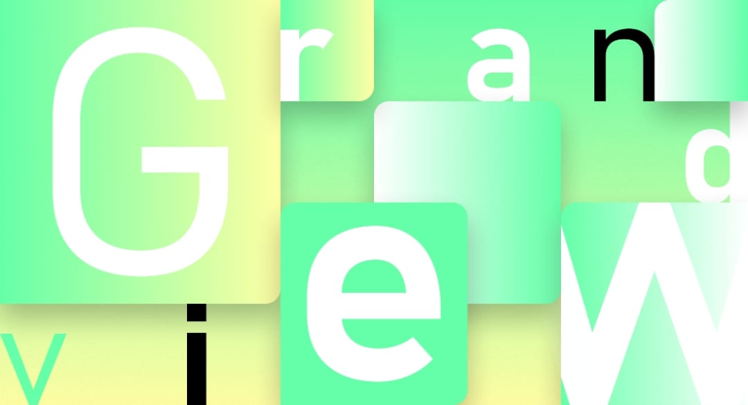
For Aaron Bell, the creator of Grandview, the task was to create a font true to the spirit of the German Industrial Standard (DIN) known for its superb legibility. Bell, also the creator of Bahnschrift, drew on this font previously created by him as a starting point, ultimately deriving the mechanical style Grandview, applicable for a wide range of uses from data visibility, gaming, and document settings.
Currently, the five new fonts are available for download as cloud fonts and trending on Microsoft’s Twitter handle vying for a popular vote as the next default font. The decision will be made in a few months after garnering user feedback on their usage. Microsoft has said on Twitter that while Calibri will no longer be the default font, it most certainly will remain available.
All Images Courtesy Microsoft 365


