Typography Aced by Anagha Narayanan
Typography designer Anagha Narayanan of Universal Thirst wins the SOTA Catalyst Award 2020. By Amiya Hisham
 The Society of Typographic Aficionados (SOTA) which celebrates the original work of young typographic artists under the age of 25 conferred its SOTA Catalyst Award to 23-year old Indian-type artist Anagha Narayanan of the Universal Thirst Type Foundry this year. She was selected for her impressive portfolio on Indic typefaces by a jury comprising Kristine Arth, KouroshBeigpour, Rachel Elnar, Caren Litherland, and Juan Villanueva. In addition to SOTA, she has also been listed by Sharp Type this year for typographic excellence.
Anagha hails from Hyderabad, a historic city in south India where she studied communication design for four years. She also interned at Black[Foundry] in Paris where she was recognized for her work on the Devanagiri script. According to her, her conscious affinity for typeface design is rather recent although the fascination may be deep-seated in the backdrop of her childhood when she often visited her father’s offset printing press. She designed her first typeface in middle-school, quite unwary of typography as a formal art form.
 Currently, she works at Universal Thirst (UT), which develops Latin and Indic scripts, based in Bangalore and Reykjavik founded by Gunnar Vilhjalmsson and KalapiGajjar. The duo draws on their contrasting visual heritage to offer a unique perspective on the type. UT has created bespoke typefaces for companies of all sizes and has an impressive record of previous clientele and collaborations which include brands such as Google, The Gourmand Magazine, Frieze Art Fair, The Bon Ton, Morse Studio to name a few. Before founding UT, Gunnar and Kalapi worked on global font projects for brands like RBS, NatWest, Marks & Spencer, H&M, Intel, and Hewlett Packard.
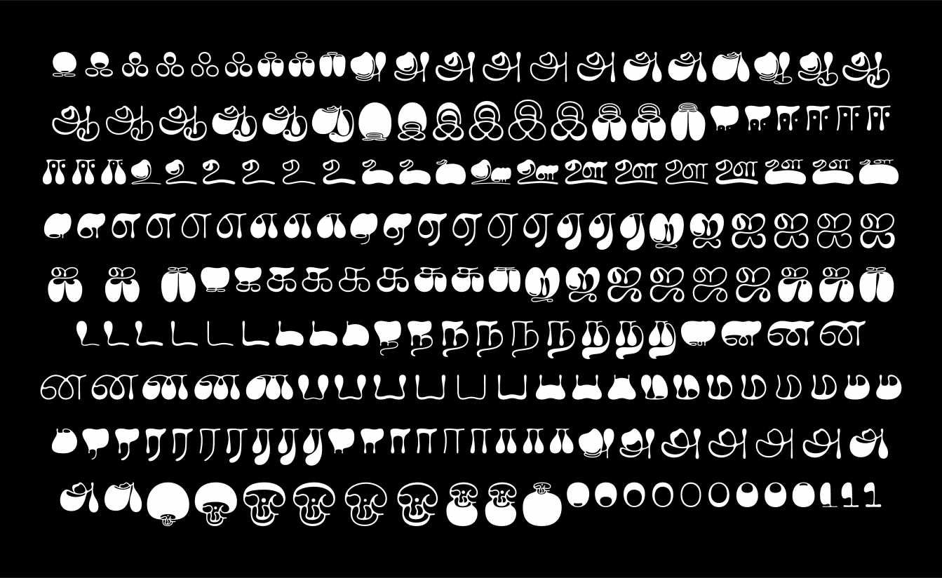
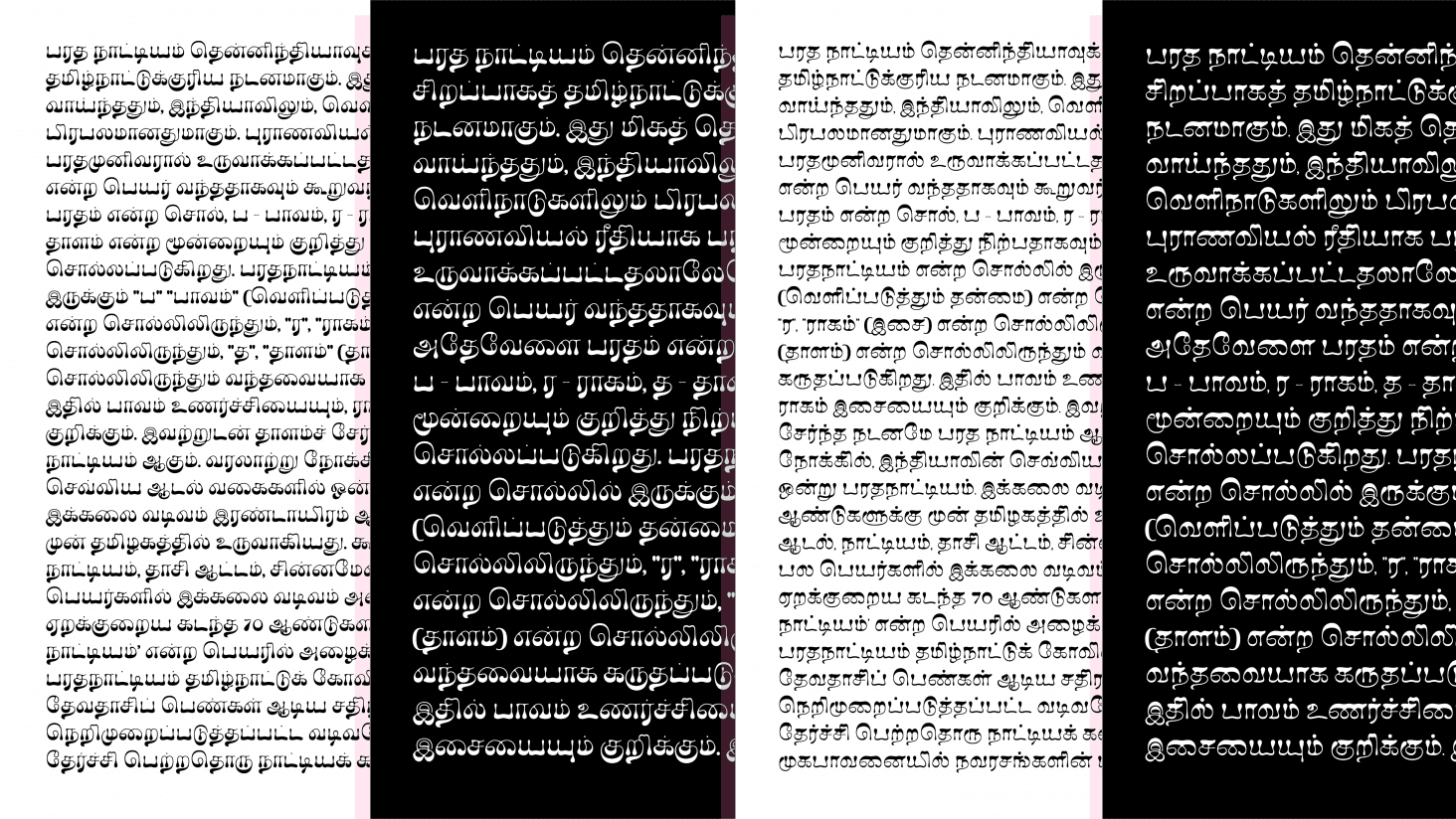
 Anagha is presently working on ‘Ilai’ a modern Tamil typeface based on the ‘60s psychedelia, a personal project under the mentorship of the senior and founding members. She accredits her recognition to the fortune of working with Hitesh Malaviya, KalapiGajjar, and inspired by the work of celebrated type designers like Shiva Nallaperumal and Ramakrishna Saiteja, who are previous recipients of the SOTA Catalyst award and also seniors from her alma mater DJ Academy of Design, Coimbatore.
Scale spoke to Anagha Narayanan on her recent work.
SCALE: Tell us a bit about Ilai. What kind of references do you work from, for scripts like Tamil which lack the typographical diversity that evolving Indic digital typefaces like the widely used Devanagari has, in terms of open-source typefaces and otherwise?
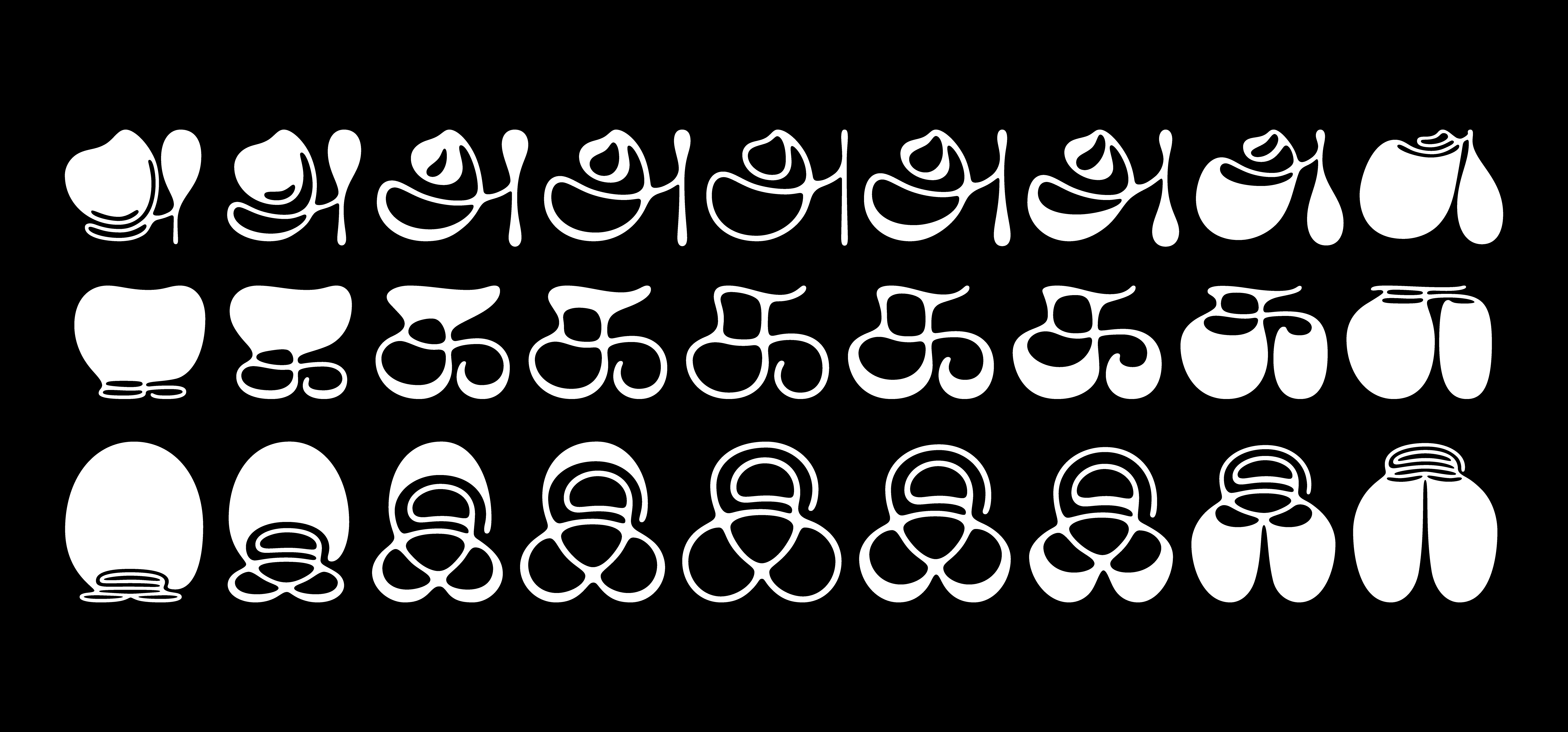
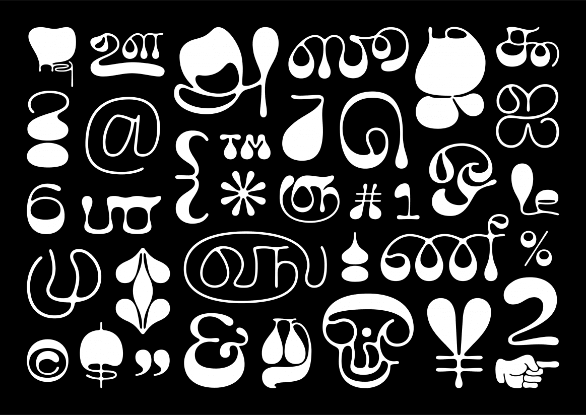
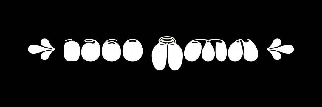
Anagha: Ilai is a fun display Tamil typeface and is the first Tamil variable typeface! It’s a really exciting project since it’s my first typeface release and I had a lot of fun working on it. It will soon be released with Universal Thirst and I’m grateful to Kalapi and Gunnar for letting me go wild with this personal project. Ilai started off with the verbal brief ‘Psychedelic Tamil Typeface’. I was always intrigued by the lettering in graphic design from the 1960’s and 1970’s, where type acted as images and the text fits itself to any form and path it may be on. The typeface, Ilai, doesn’t really draw inspiration from a single piece, but more from the idea of distortion, unconventional weight distribution, text as image, and experimental works.
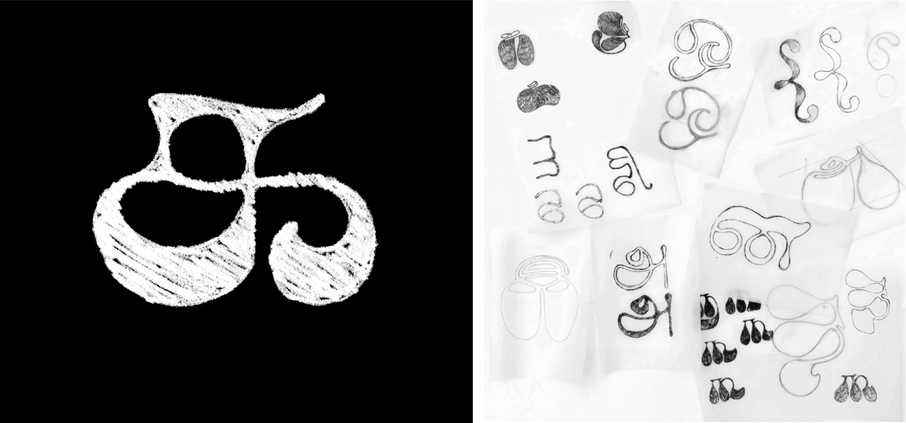 My process involved a lot of sketching on paper because it was more natural for me to create and explore organic shapes on paper first. One of the most enjoyable parts was drawing the glyphs in different weights. It was particularly special since I dealt with each weight with a fresh perspective where the two extremes are so drastic in some cases.
Another challenge is that since Ilai is the first Tamil Variable typeface, and is also very experimental, I didn’t have any precedents to refer to, therefore having to figure out a lot of solutions from the ground up. I believe Indian graphic design is rich and in particular Tamil doesn’t lack typographic diversity, but it’s true that a lot of it has gone undocumented.
SCALE: Universal Thirst works in both Indic and Latin scripts – do fonts like Ilai gear towards a unified multi-script font family?
Anagha: Ilai started out with a vision to only have Tamil and Latin support. While Tamil is already designed, I wish to add Latin to it eventually too.
 SCALE: Typeface design in Indic Scripts is a relatively new and fertile creative ground – who are some of the inspiring figures around you who are paving the way and serve as inspiration?
Anagha: Each designer at Universal Thirst is unique in their own way — Gunnar, Kalapi, Rocky, Anurag, and Namrata are each so talented and full of great ideas. Working with them has been tremendously inspiring each day. Really excited to share all the fun things we’ve been unto with the world.
SCALE: Would you agree that digital type design in India is now an act of preservation by default?
Anagha: I agree that our work as Indic-type designers aids people by providing them with well-designed typefaces, and therefore promotes their usage which in turn helps in preserving the scripts. Type design is so closely knitted with culture and history and does the task of preserving it graphically.